A Peek Into Holos

This (previously) private post is a comprehensive look on how we see AR/VR technology developing and our blueprint for crafting a software platform that will catapult AR/VR into the mainstream. We were sharing this document with potential partners and investors who are passionate about product design and feel they will be critical factors in making mainstream AR/VR adoption inevitable. On that note, we’re glad to have you here.
First, a story.
While we have been working on Holos for about a year and a half, it wasn’t until fairly recently that we realized the ultimate potential of what we had been building. Oddly enough, it was the process of writing a 20-page research paper that prompted me and my team to re-imagine how we could fundamentally change the way people interact with information.
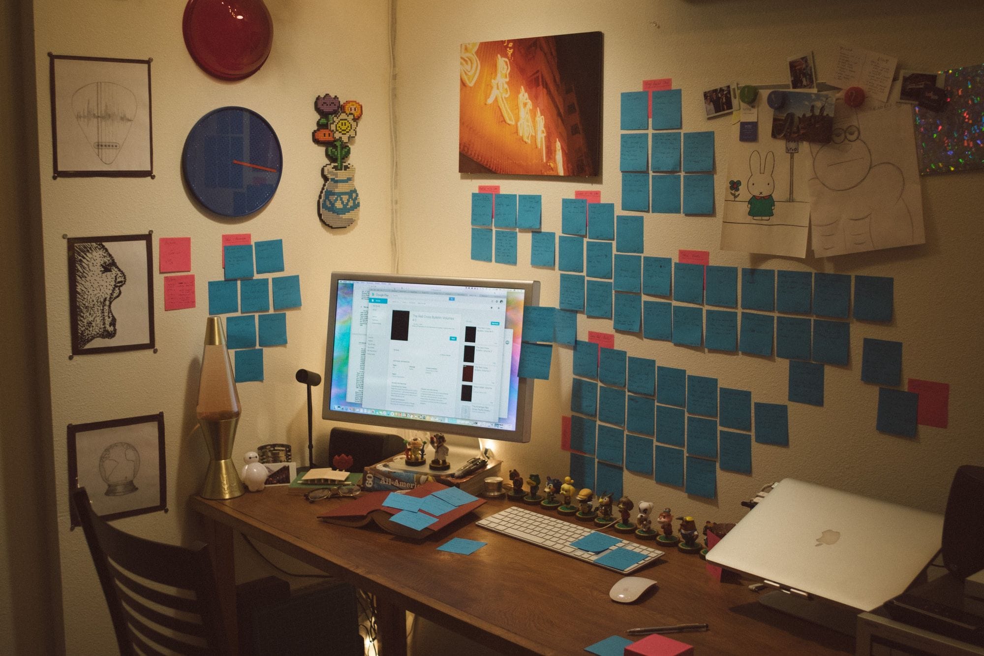
When I was working on my research, I realized just how hard it is to make connections. How on earth was I going to write 20 pages on something I had zero knowledge on? My ability to sort and make connections was limited by the interface. I was juggling physical with digital, and the content existed in different realms. I parsed the content of 20+ physical books and another 15 or so scanned resources found on the web from 10 different sites. I had to break it down before I could build it up, so I took notes on anything that stood out and compiled them on my wall to organize the connections. Without the third dimension, it would’ve been nearly impossible to sort through everything. My on-screen desktops quickly got too cluttered to understand how different pieces of content were related to each other. Using my analog solution, however, I was able to successfully complete my magnum opus on time.
Figuring out the workflow was 60% of the work while actually writing it was the other 40%. The physical workflow that I established during this process can be brought into VR, but with the added benefit of intelligence. What if the objects in the picture above could be aware of each other? What if they could link to the source of the content? It’s this kind of thinking that proves that spatial interfaces don’t have to be messy; we can balance literalism with behind-the-scenes intelligence to create something magical.
Two-dimensional interfaces limit how well we can contextualize and organize content. VR has all this space, and yet current solutions do very little to utilize this. Therefore, we need to rewrite the rules and bring the content and applications out of the Windows desktop.
Legendary interface designer and computer scientist Bret Victor says that
“back in the days of Roman numerals, basic multiplication was considered this incredibly technical concept that only official mathematicians could handle. But then once Arabic numerals came around, you could actually do arithmetic on paper, and we found that 7-year-olds can understand multiplication. It’s not that multiplication itself was difficult. It was just that the representation of numbers — the interface — was wrong.”
We truly believe that great things happen when people are allowed to naturally interface with computers. This is so important and it’s what drives us every day: playful, frictionless experiences allow for new thoughts to flourish, new connections to be made, and for greater clarity to be had. If the interface is able to disappear, people can focus on what matters: the task at hand.
Our view on the Market, Now & Later
2017 Our relationship with personal technology is more intimate than ever. Billions of people have laptops & smartphones: we use them as tools to augment our abilities and patch around our deficiencies. They’re our memory prosthetic, navigation aid, digital telepathy device, fact-checking tool, creativity canvas and much, much more. Take away someone’s phone and they feel incomplete. Despite the proliferation, they’re still distant 2D projections, and still just tools. VR, AR, and body tracking will change that.
2022 Primitive wearable technology from 5 years before has shrunk, optimized, and become nearly invisible to those not looking for it. The smartphone has evolved into a small, screen-less computing brick; an exocortex worn on the body, orchestrator of the personal symphony. It provides a central computing hub for biosensors, sensory substitution devices and more. This platform needs a display and interface — and VR/AR devices are prime candidates. The clunky VR and AR headsets of yesterday have merged into a single lightweight device, capable of translucent or opaque stereo rendering at variable focal distances. The form-factor resembles thick sunglasses, and the device is covered in outward-facing sensors that track the user’s body in great detail. These sensors focus mostly on the head, eyes, face, and hands.
What this allows for is a powerful new system unlike anything seen before. It is at once a super-set of our existing technology, comfortable and familiar, and yet simultaneously the most personal and empowering technological shift in history. This technology is experiential; it is lived, not spectated. Gone are the abstract interfaces, novels of explanatory text, labyrinthine mazes of commands and the frustrating lack of feedback. They have been superseded by a paradigm that is spatial, physical, and in every way tailored to human needs & intelligence.
Apple understands this, and they’re gearing up to become the dominant player in spatial computing for the AR/VR ecosystem. They have recently released the world’s most accessible AR development platform, ARKit, are currently hiring 3D interface designers, have revolutionary hardware on the way, and have historically been the catalyst for bringing emerging technologies to the masses. Apple will no doubt succeed because they will have great hardware working in harmony with great software.
Revolutionary hardware with underwhelming software such as Google Daydream or Oculus Home will not be enough for HTC, Samsung, Snap, or anyone else that decides to compete with someone like Apple. Revolutionary hardware designs rarely succeed on their own. The day that Apple announced the iPhone, the whole smartphone industry had to start over because they weren’t ready for the multi-touch paradigm.
Fred Vogelstein, the author of Dogfight: How Apple and Google Went to War and Started a Revolution, said that the iPhone “was not only cool looking, but it used those cool looks to create entirely new ways to interact with a phone — ways that Android engineers either hadn’t thought possible or had considered too risky.”
Spatial computing is what will catapult AR/VR into the mainstream. Companies that lag behind in developing and integrating this new interface paradigm will miss the wave of mainstream adoption and will find themselves in a similar position as Microsoft and RIM during the smartphone revolution. The great hardware outside of Apple’s walled garden will need great, native software working in harmony with it. This is what Holos brings to the table.
The implications around defining the user’s relationship with their personal technology are powerful.

Where does Holos fit in?
This new paradigm needs a solid foundation designed to take full advantage of the strengths of the new medium. The biggest bottleneck is no longer how much raw power we can fit onto a chip, but how we use that power. For the vast majority of people, computers are still too difficult to master— and truly robust solutions will require elegant, multidisciplinary design at the intersection of everything from behavioral psychology to ergonomics, real-time 3D simulation, art, and much more. That’s where Holos comes in.
Holos is currently a prototype of a fully mobile and spatial OS, following closely the principles of Human-Centered Design. It is designed from the ground up to take full advantage of the affordances of VR/AR & body-tracking technologies. We engage the different intelligences across the human spectrum, from the kinesthetic, the aural, the spatio-visual, and even the intra and inter-personal. Users can pull content from multiple sources and services, or create it themselves. They can organize that content in the same way one would decorate a house or workspace — putting knowledge into the world for greater comfort, efficiency, and memorability. Commonly used tasks or tools can be directly anchored to the body for quick use in nearly any context, or can be places into the world to satisfy a deep-seated ‘nesting’ urge.
Interface elements respond to physical force and are, by default, manipulated directly by the user’s hands. Many actions in Holos don’t even need to be explicitly taught because of this; these behaviors are so common and innate that most people understand how to use the interface naturally. This makes it very much unlike desktop and smartphone UI layers, as well as most other attempts that are found in the current VR ecosystem. Our system will allow people to create, discover, remember, and experience their digital lives like never before.
Why so different from the familiar?
What we propose is a radical departure from the world of mouse cursors, flat-shaded windows, swipes and taps. At first blush this might seem risky, but we have a solid case that it’s not only a good idea, but absolutely necessary for the mass user adoption of VR and AR. As stated before, there are other attempts in the market that port existing OS paradigms into VR, but do these attempts do anything better than their source inspiration? Do VR headsets have higher resolutions than flat monitors? Is typing or using a mouse better in VR than at a normal workstation? Does swiping on a thumb pad or clicking & pointing really work better than swiping & tapping on a smartphone? If not, why would a user ever do anything in VR/AR? It would be easier and more productive to stick with what they know.
We’re at the dawn of several technologies, like AI, ML, natural inputs, and spatial interfaces. Holos is the forward-looking interface that converges these technologies into something that’ll take us into the next 50 years of computing.
Therefore, we must take the plunge and design a new system around the strengths that this medium provides, no matter how many old lessons we must throw out. All of the abundant headsets and low prices in the world won’t get users to adopt a technology that does nothing for them. We have a plan for this future that starts simple and unfolds in complexity over time, reducing risk for all parties, including end users. That said, what future can we create in VR & AR?
First, understand that people think spatially.
- I’m falling in love
- That was a roundabout approach
- Above all, I want you to consider this
- That’s beneath me
- We’re on the right path here
- You’re just going in circles
- Everything’s up in the air
These phrases may seem simple, but they’re indicative of deep-seated methods in the mind that attempt to manage and solve everyday tasks. Let’s look at another example. The first time you’re given a workspace, what do you do? You start putting your tools and materials in different places. Subconsciously or consciously, you place things in the world in just the right way so that you “get” what’s going on. You place things in certain places so that you’ll remember. You place things in certain places to minimize friction. Holos lets you do things in the same way. You can create an endless array of digital workspaces, wherein each one is tailored to exactly the task at hand. Old, flat computing tried to let you do this, but Holos lets you do it for real. Well, as real as a synthetic world gets.
People communicate using imagery quite well. It’s excellent for getting across things that words struggle with. That’s why emoji and image embedding exist. Imagine this upgraded to the third dimension. Instead of flat projections, you can conjure up real models of exactly what you want to describe. The majesty of a mountain range or the intricate mechanics of an engine can simply be called up and held forth for someone else to observe. This time, with all of the depth, motion, scale, and proportion intact. It’s the closest thing you’ll get to digital telepathy until actual digital telepathy shows up. And it’s *much *cheaper than trying to build any of those things in the real world.
People also think with their bodies.
As soon as we’re born, an incredible process starts. We go out into the world and start touching everything with our hands. We run, jump, and spin to learn physics. Everything that we do is a process of action and reaction. As we do this, powerful associations are built. Have you ever noticed how you remember where something is with more precision if you’re the one who placed it there, even if you look at it far less often than an item that someone else has placed? In Holos, as you’re placing objects with your hands, walking around the world, scaling & stretching things, squishing them together into groups, calling up menus or just about anything else — you’re using your body to do it. Body motion is directly mapped to space, and consequently, this effect is amplified with the principles of spatial thinking as mentioned before. These practices are infinitely more powerful in VR/AR than in traditional computing.
Great, but what about Augmented & Mixed Reality?
The world is alight with hype about VR, AR, and XR. And rightfully so; the potential to transform the human condition is profound. One might ask, can Holos function outside of just VR? Can it extend its utility into the other immersive technologies? We believe so: While Holos is designed for VR, it is more about interfacing with the human body and mind than with VR itself. We have set a paradigm that uses eyes for focus, hands for intent & control, and voice for categories & hierarchy skipping. These paradigms are accessible to us in AR/XR as well. Bringing Holos into AR is as simple as rendering over the real world instead of a virtual one. Wherever there is robust body tracking, we will be there to augment the user and enhance the human experience. Just as the iPod put 1,000 songs in your pocket, Holos and our wearable interface puts the digital universe on your wrist, no matter what reality you’re in.
The Building Blocks of Holos
Along our journey of architecting an operating system that’s approachable for everyday people, we’ve come up a language that’s not only logical, but also scalable.
Capture: the purest form of content.

Captures are pieces of content that are boiled down to their elemental form. They can represent an external VR/AR application, a link to a WebVR world, a link to a 2D site, a picture, a text snippet, or a video, just to name a few. People will be able to Capture content throughout the day on their phones and PCs and have it available to them when they get to their homespace. Within the homespace, they are sourced from the menu, from which people can pull them into the space and interact with them. They can be organized spatially and persistently in the homespace, they can be used as hyperlinks to other experiences, and they can interact with Cards, Slates, and 3D objects to expose new functionality (more information is found below). With Capture, we’re prioritizing content, not the source from which it came from.
Card: the smallest kind of application.
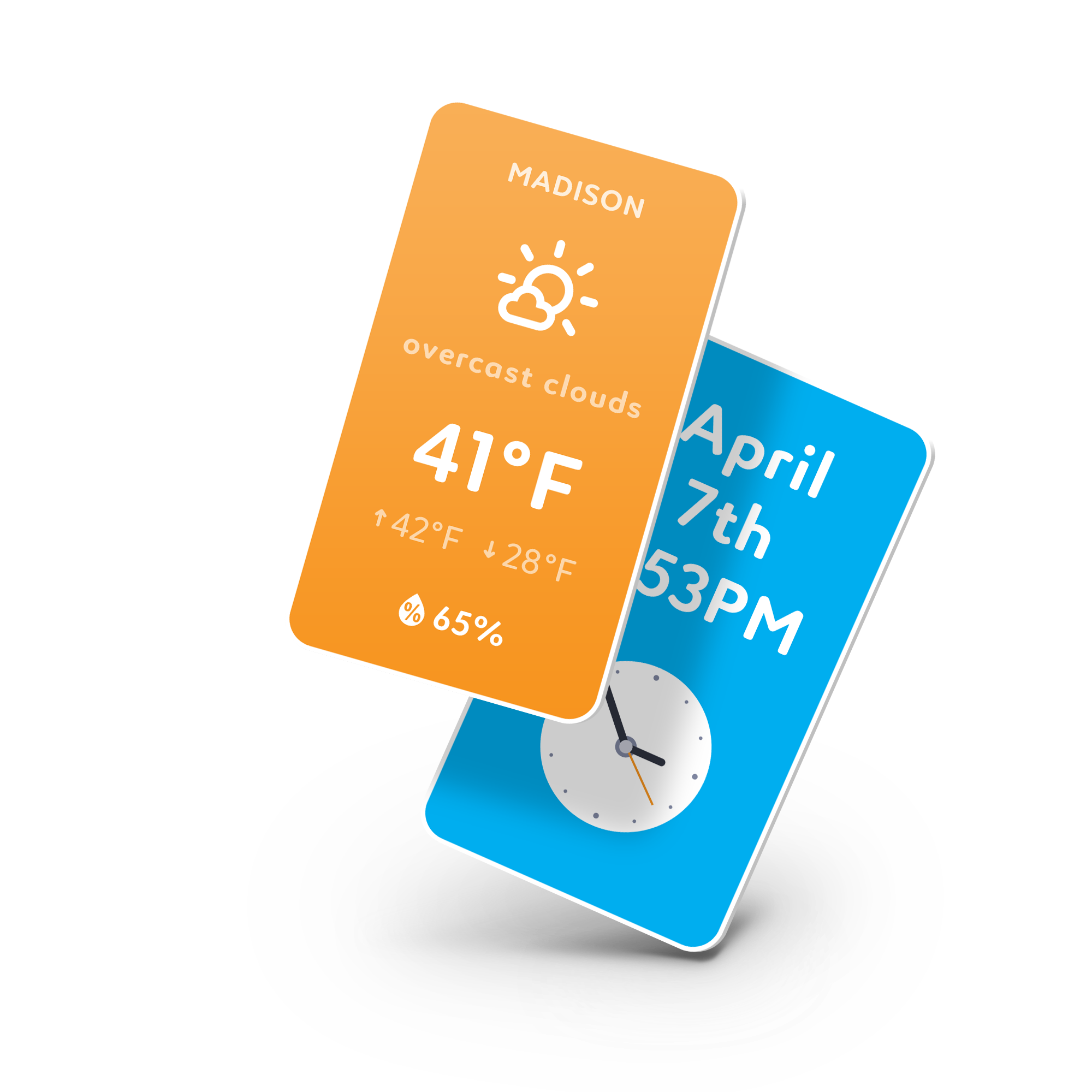
Having your favorite content accessible in a snap is great, but wouldn't it be great to have content that is smart? A Card is a web app that can be interacted with much like a tiny touchscreen. For developers, the creation process is simple. Cards, in concert with our simple framework, are created using HTML/CSS/JS or any web stack that the developer prefers. Cards are familiar, yet versatile, making them the perfect base for our system. Developers have already started building for this paradigm.
Slate: the native application.
When developers are working on new software, they often don’t want to write a lot of boilerplate code or make their own UI controls/widgets. In the case of VR, it can be downright paralyzing to have to worry about creating something as simple as a button. The process of designing UI components looks simple, but actually requires deep technical ability and design knowledge that ultimately has little in common with traditional design. To bridge the gap between native, proven paradigms and the developer’s content, we’re developing Slate, a system akin to Windows Forms designer, Qt, or Xcode’s Interface Builder. With Slate, you define your UI layout using XML. When translated by Holos, and it will apply our native interface elements into a layout specified by the developer. Once the layout is translated into something that’s fully 3D and interactive, the developer can hook their function calls into the events exposed by our native elements. Developers can focus on the high-level design and behavior, while we handle all of the hard parts of the design, such as ergonomics, feedback, and activation heuristics.
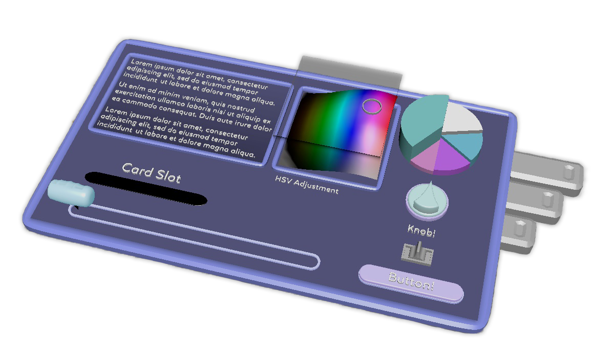
Examples of UI controls/widgets we plan on supporting in Slate — text boxes, grabbable scrollbars, color pickers, knobs, switches, buttons, and pull-tabs.
With Slate, developers can create either flat or curved interfaces. Since they can specify the location of controls relative to a surface, developers can make several surfaces full of physical controls, much like a cockpit or control room, placing each “panel” relative to each other in 3D space. Developers can also let the user place them wherever they’d like in their space. Slate allows for the design simplicity and accessibility of a 2D user interface while allowing developers to take advantage of the spatial computing paradigms set forward by Holos. End users gain the benefit of having a VR-first multitasking environment at their fingertips.
Synergy among them

By intelligently recognizing where content is from and what is inside of it, we can create useful links amongst them. An article from UploadVR can point to an UploadVR app, where one could find their newest articles. If someone captures a picture on their phone or computer, we can use machine learning to identify what is in the picture, automatically tag the content, and then use that information when a user tries to recall something from their collection.
A Capture could be dropped into a Slate app; this would allow people to share an image from their collection to a Facebook app or to add an attachment to a letter. The possibilities are endless.
Integrating a Ladder of Complexity
You may be noticing a trend here. Pure content is easily accessible to users and therefore developers in Holos. The creation of a Card is simple and familiar to existing web developers. Slate is a bit more complex, but is a natural step up from the Card. Eventually, we’ll have more and more complex methods, each slightly more powerful than the last, until a developer can go all the way up to programming physical objects and even entire VR worlds. This unfolding of complexity also means that we can focus on engineering one small scope at a time, allowing us to focus on making sure each step is implemented as best as possible.
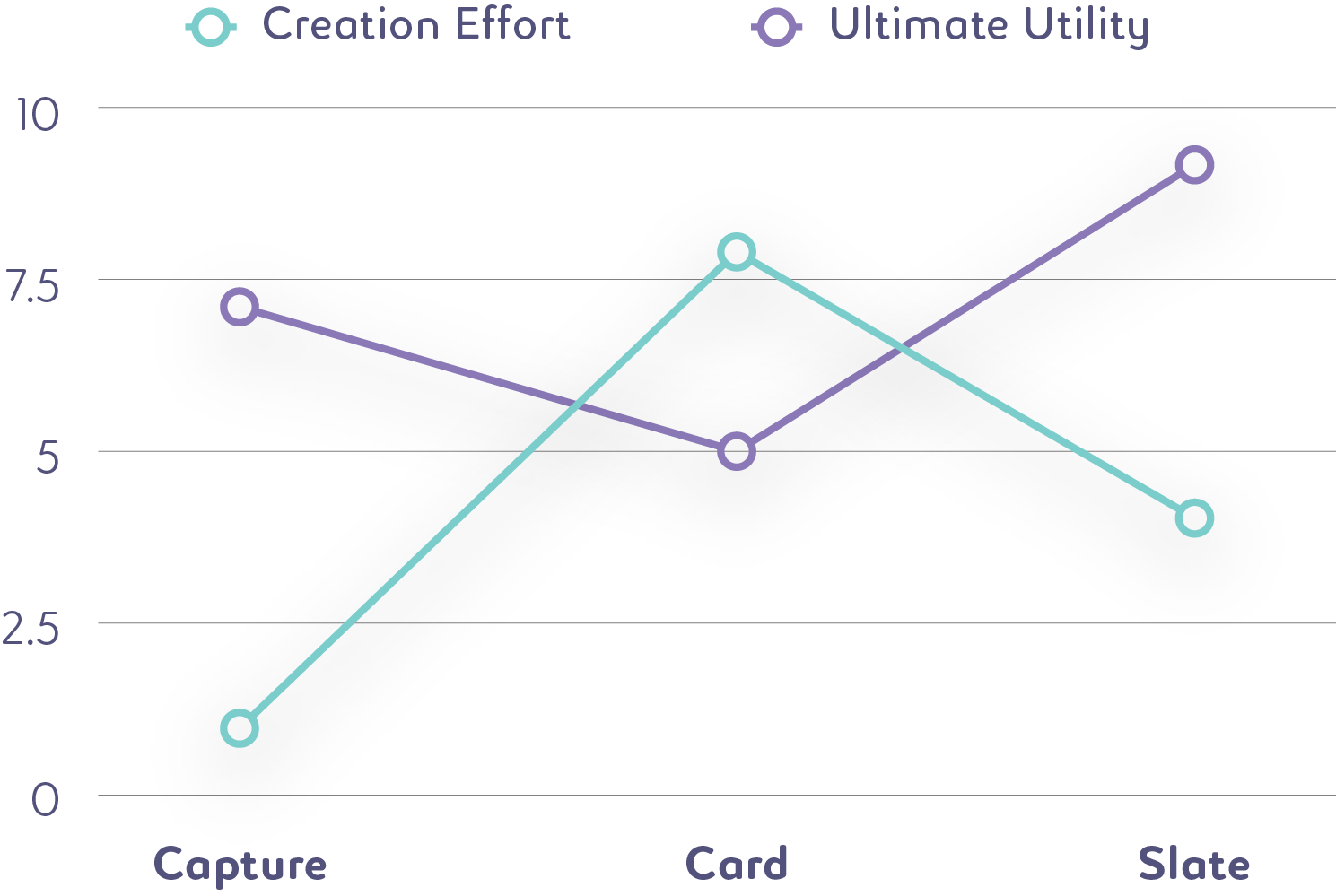
For end-users, the story is mirrored. Having raw content (from Capture) available in their space is immediately valuable for purposes of decoration or linking thoughts. The process for capturing content is frictionless and easy as it integrates nicely into existing workflows. Cards offer additional functionality where pure content cannot. Slate applications offer the largest amount of functionality and are best suited for focused tasks.
Using Holos for Everyday Tasks
We’ve laid out a number of high-level concepts above, but what do we currently have integrated? I’m happy to report: it’s quite a lot.
Simple Content Consumption
Getting at content is easy and available from any context. Since most other workflows touch the Main Menu at some point, it’s listed here first.
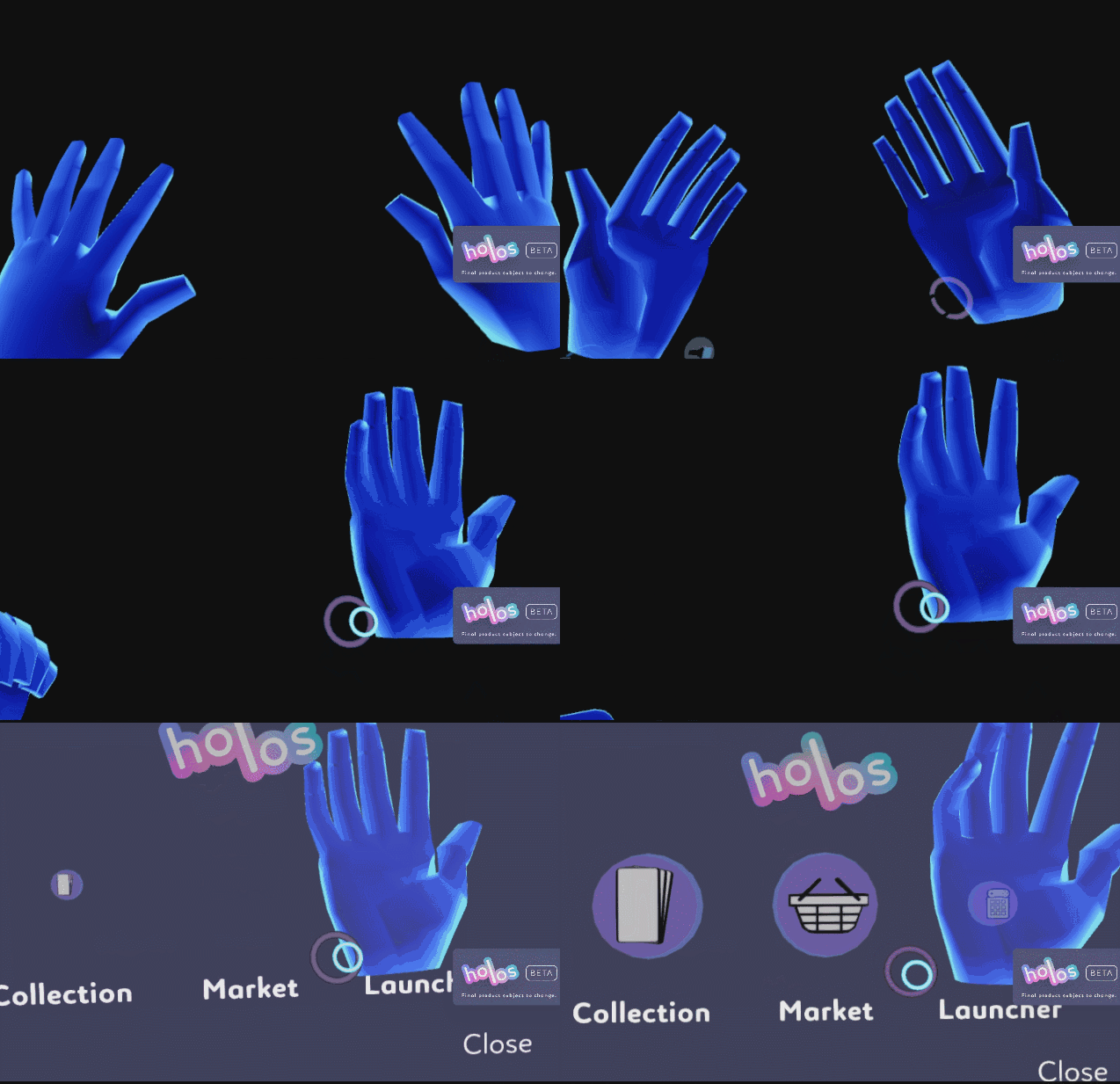
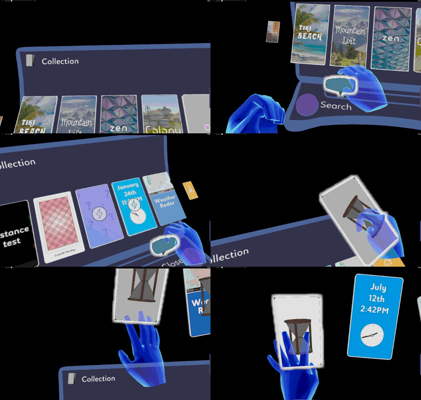
Content menus are simple and intuitive. Scroll to browse, then simply grab and pull the content to get it. Like so:
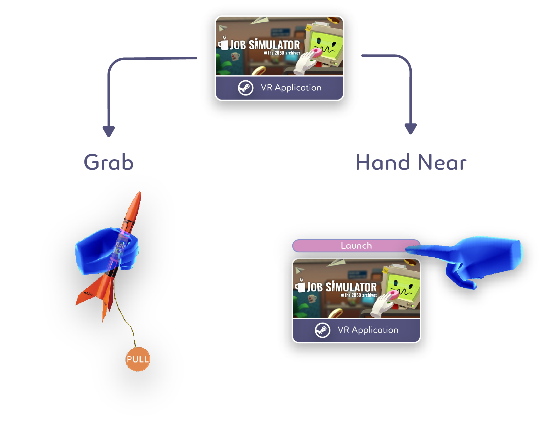
- Launching a fully-immersive experience app
First, the user opens the Main Menu. Then, the user goes to the Launcher Menu. Once there, they can simply find the app they want to launch. They can either launch it there, or turn it into a Capture and pull it out into the world, placing it wherever they desire. This type of Capture triggers the launch of a fully-immersive VR program. It can be used in two ways:
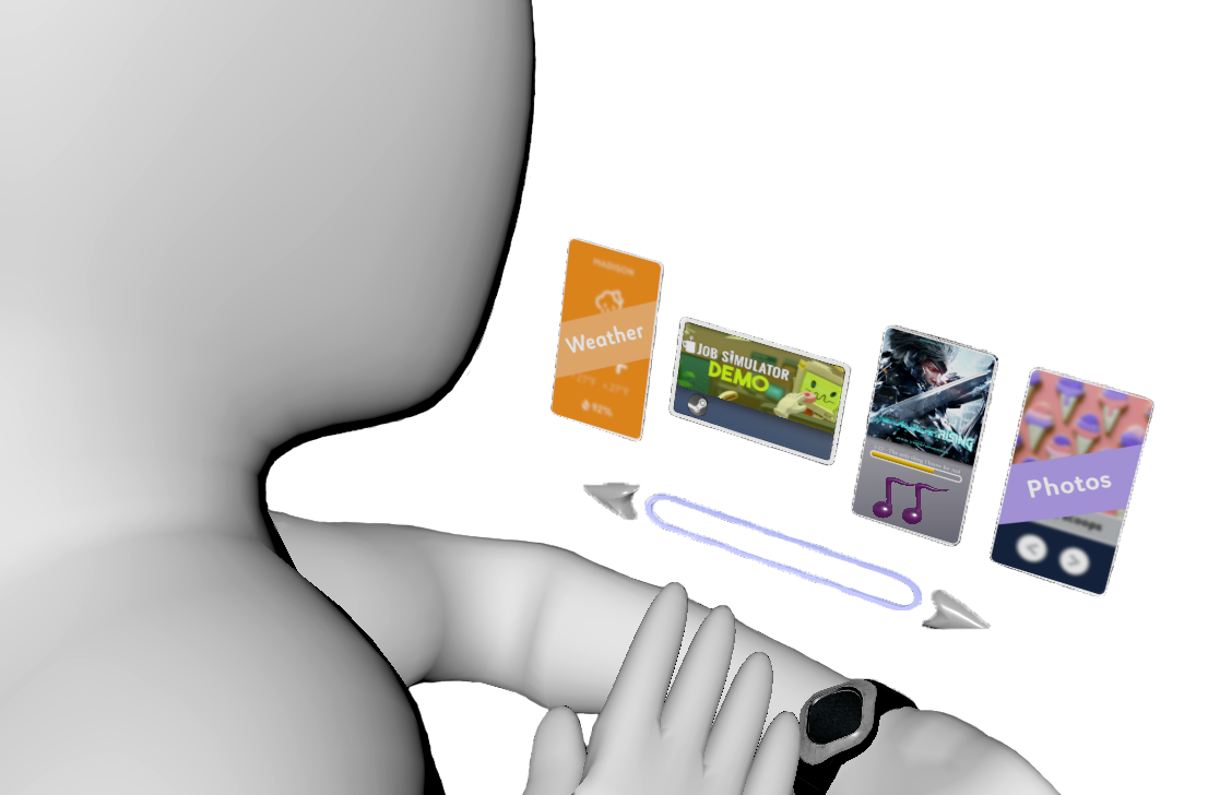
- Music
There will no doubt be endless ways to enjoy your favorite tunes in Holos. For the universal case, simply go up to a Capture that represents audio data and tell it to play. As in the example above, there will be both a fast and a fun method of launch available. However, the most common case we predict involves the use of a Quick Inventory menu.
- Videos & Pictures
Much like music, we’ll have our own in-house video & picture viewers, and developers will also be able to craft and distribute their own ideal versions.
Existing in the space, or, “Being at home in VR”
Customization of the person’s space has been a core tenant of what we’ve done since our Alpha. We believe that people will only truly be comfortable in VR if they have complete control over their surroundings.
- Visiting Other Worlds
Users can either locate a Space that they’ve previously placed into the world or they can grab a new one from their collection. Once it’s grabbed in the world, it will turn into a portal sphere. Gently apply it to your face and you’re transported to another Space.

- We decided to use Portal Spheres for several reasons:
- Valve established them as a convention in The Lab. Users may already be familiar with them.
- Facebook Spaces also uses them, strengthening the convention.
- They are appealing and naturally draw in the user’s curiosity if the user has never seen one before. Inspecting it closely triggers the action. This is exactly the kind of thing you want in a UI interaction.
- We can also give distance-until-activation feedback, further signifying to the user that their investigation is valid.
Customizing the Environment
There will be many ways of customizing the environment. The major difference between them is the scale the user operates within. The user can either move around the world; placing, deleting, and interacting with objects as they please, or, they can hold the world in their hands as a miniature, poking their head in and customizing it as though it were a dollhouse. In either context, the Quick Inventory will reduce the amount of tasks the user has to perform to accomplish this.
Conscious Content Curation
People can create an associative “wall” of content with things like pictures, videos, text, or videos. By consciously organizing content in their space, people can sustain long-form thoughts and make connections between individual pieces of content (see an example of this below).
Communicating with Voice
We currently have a tutor character named Arnold (as seen earlier in the article) that helps people become acquainted with Holos. The vast majority of people learn best when they have someone who can show them how things directly, and Arnold accomplishes this. Users also tend to pay more attention to voice instructions than text instructions. Currently, Arnold provides both. People will be able to call each other, leaving holographic voice messages for one another. We believe that there is a place for non-realtime communication in VR as there is on other devices. Arnold will later respond to voice communication and will be able to be “called” in the same way that you would call a friend in Holos. Lastly, the interface will be able to be navigated via voice controls.
Wrapping things up
The core foundation that we’re building and the overarching beliefs that we’ve outlined represent the strongest and most promising path forward for personal computing in AR/VR.
We’ve put an enormous effort into learning and experimenting with the best user interface and experience practices in VR. We are ready and excited to share our findings with developers to create an ecosystem and platform around our lessons learned. For a system like this to work, it has to scale, and we firmly believe that we have the tools to do so.
That being said, we’re humble and love to collaborate on new ideas and implementations. Our biggest goal is to reach millions of people that find joy, utility, and freedom in what we offer.
“I invented nothing new. I simply assembled the discoveries of other men behind whom were centuries of work. Had I worked fifty or ten or even five years before, I would have failed. So it is with every new thing. Progress happens when all the factors that make for it are ready, and then it is inevitable. To teach that a comparatively few men are responsible for the greatest forward steps of mankind is the worst sort of nonsense.”
— Henry Ford
This writeup was a collaborative effort here at Holos between Josh, Dan, and myself.
