Long Live HyperCard

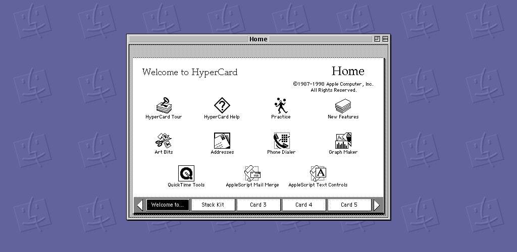
Originally conceived as a software Erector Set in 1987, HyperCard gave non-programmers a way to put together interactive information. Sounds simple, right? It is. HyperCard’s creator, Bill Atkinson, wanted to create something that would allow people from all backgrounds, from elementary to enterprise, to easily create and maintain content. Let’s take a look at what exactly HyperCard was and how it was used throughout its lifetime. Afterwards, we’ll take a look at how its simple metaphor could be used today.

HyperCard is based off of three basic constructs:
- Cards
- Stacks
- Buttons
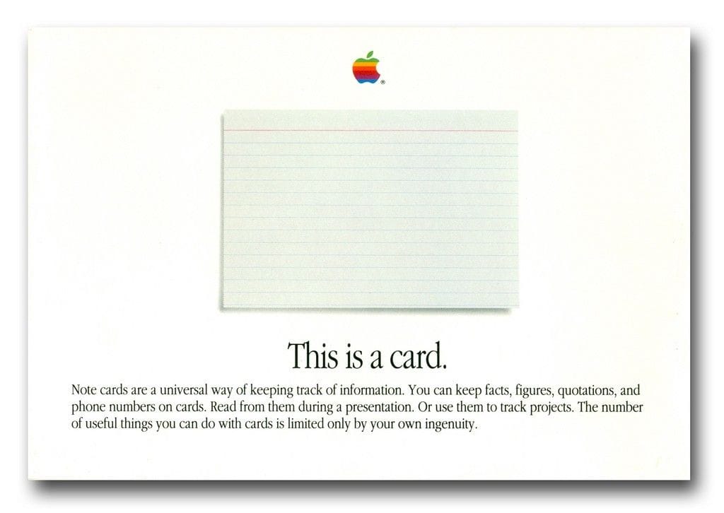
Cards in HyperCard are much like index cards, except smarter. Quite a bit smarter. Stacks are collections of cards that live together. Using buttons, you can link between the different cards and start to create something really interesting. These three concepts alone are very simple but also very powerful. Combined with the different tools that are included with HyperCard (painting, linking to other applications) and the accompanying scripting language, HyperTalk, HyperCard stacks start to become pretty extensive and powerful. A study in Melbourne revealed an extensive list of how educators were using HyperCard in the classroom:
- A stack of multiple choice test questions
- Assembling, storing and delivering teaching materials that included graphs from Excel
- Making class KeyNote-like presentations and handouts for students
- A calculator that included a variety of mathematical functions and graphing capabilities
- Computer aided instruction in the sciences incorporating animation and sound
- Geographical Information System tutorial
- Oil-spill modeling
- Literacy development
- Road safety
- A database front-end to an Oracle database
- Selecting and playing tracks on a videodisk
- An interactive educational presentation showing jobs in the wool industry
- ‘Beach Trails’ — exploring the local sea shore and shells.
- TTAPS (‘Touch Typing — a Program for Schools’)
On top of that, one of the (if not the) most popular Mac games of the 90s, Myst, was built using HyperCard. Cyan, the developers, built the game in a way that each Age was a unique stack and navigation was handled by an internal button system using HyperTalk.

One of the largest achievements of HyperCard was its accessibility. Especially in a time when personal computers were a relatively large investment to bring into the home, HyperCard gave people of all ages a platform to quickly create their own uses out of the computer, even if they weren’t always practical. HyperCard was kind of like how computer games were to computers like the ZX Spectrum at the time. Buyers could justify the cost of a home computer more so if it was also an entertainment device. HyperCard and MacPaint gave users a clear way to understand the potential of computing in the home and also allowed for users to have a more hands-on approach to programming than with BASIC at the time. Users could start out within their comfort zone in HyperCard and then move into HyperTalk when they felt ready.
Users continued to embrace HyperCard well into the 90s; the last stable release was in 1998. HyperCard managed to accumulate quite the following in its fifteen year lifetime. The Computer Chronicles aired an update to what was going on in the world of HyperCard in 1990 and showed how HyperCard could be used as a powerful music creation tool or an animation engine with 3rd-party scripts.
The International HyperCard Users Group, or iHug, estimated that 2002, there were still about 10,000 active HyperCard users in the world. Not only were there still that many users, but these users were still largely invested in the HyperCard ecosystem because they’re passionate about its structure and possibility.
Two or three times a year iHug collects several thousand dollars in donations to set up booths at Macworld Expo and promote HyperCard on Apple’s behalf. “People send (money) in because they like HyperCard so much,” said iHug president Michael Mays. “When people see what you can do with it, they say, ‘Wow. I never knew you could do that so easily with a computer.’” — WIRED
HyperCard’s design language gave it a lot of potential to move beyond just the desktop. In a 2002 article from WIRED, Bill explains that HyperCard could have been designed in a way to allow it to be the first web browser, saying,
“I grew up in a box-centric culture at Apple. If I’d grown up in a network-centric culture, like Sun, HyperCard might have been the first Web browser. My blind spot at Apple prevented me from making HyperCard the first Web browser.”
The first browser to tie images with hyperlinks on a single page was developed by the National Center for Supercomputing Applications (NCSA), as a project they called *Mosaic* in 1993. When you compare HyperCard’s core ideas against that of Mosaic, you can see that it really wouldn’t have taken much to bridge the gap and push HyperCard as one of the first interactive interfaces for the world wide web. Web design trends moved on and websites got more complex over time, dumping more information on increasingly smaller screens. In the past couple years we have seen pushes towards a card-based framework for the web (see Pinterest, Google Now, Trello, etc.), but we’re far from wide-spread adoption. Most importantly, a card-based framework simply doesn’t work for all applications.
Moving forward, how can this great metaphor inspire us to make future technologies accessible? How can we channel the simplistic mission behind what Bill and his team were trying to achieve when we look at emerging platforms such as virtual reality?
What is the right design language for VR? What metaphors can we use to make VR friendly and full of possibility like the first personal computers?
That’s for all of us to figure out.
Bonus: If you’d like to see a cheesy promo from Apple for HyperCard in 1987 with a sentimental closing by Bill Atkinson, check out the video below. Hopefully you’ll enjoy it as much as I did.
Tyler is a Co-Founder and leads Product Development and Design at Holos, Inc..
Check out our website, www.holos.io, to learn more about out next-generation VR homespace, Holos.
